The Digital Journey of Buttony: A Front-End Tale
Written on
Chapter 1: The Creation of Buttony – A New Era Begins
In the bustling realm of WebApp City, a small button named "Buttony" came into existence. Born from the skillful hands of a front-end developer, Buttony's sole purpose was to be clicked. Unbeknownst to Buttony, the path ahead would be filled with excitement, obstacles, and a few pesky bugs.
Buttony's story began during a brainstorming session, where the developer declared, "We need a call-to-action button for our new site!" And thus, Buttony emerged, adorned in a sleek blue design with a bold label proclaiming, "Click Me!" Buttony was like an enthusiastic infant, fresh and brimming with potential, styled in the latest CSS trends and backed by a strong JavaScript framework. "I’m ready to shine!" Buttony thought eagerly as it was launched into the digital world.
Chapter 2: The Formative Days – Allies and Adversaries
The initial days of Buttony in WebApp City were thrilling. It quickly made friends with other UI components like Navbar Nina, a tall and graceful menu; Footer Fred, who always wrapped things up nicely; and Modal Molly, a bit dramatic but always reliable when needed.
Life was delightful. Users engaged with Buttony through clicks, hovers, and various interactions. However, as with any newcomer, Buttony soon discovered that web life had its challenges. Some users clicked too quickly, some too forcefully, and others didn’t engage at all!
Then came the browsers. Modern ones like Chrome and Firefox played nicely with Buttony, but older versions were a different story. Internet Explorer, in particular, was like that cantankerous grandparent who never quite understood Buttony’s appeal.
Despite the ups and downs, Buttony relished being clicked. “This is my purpose!” it thought, savoring each interaction like a pet waiting for affection.
Chapter 3: The Teenage Phase – Learning and Adapting
As the web application grew, Buttony faced the need to adapt and learn new skills. Users sought more than a basic button; they demanded animations, color transitions, and even sound effects. Ready to rise to the occasion, Buttony thought, “I can handle this!” as developers integrated exciting hover effects and accessibility options.
However, these enhancements brought about some growing pains. Occasionally, Buttony’s new features clashed with the old ones, leading to awkward moments—like when a new hover effect didn’t mesh well with the established layout, or when a user’s browser failed to recognize the updated styles.
Buttony felt akin to a teenager experimenting with different fashions—sometimes nailing the new style, other times feeling out of place. Buttony’s developer guardians were supportive, continually adjusting and refining to keep Buttony up-to-date. Yet, Buttony began to feel the weight of the constant changes.
Chapter 4: The Midlife Challenge – Enter the Newcomers
The situation shifted when developers introduced new components—Button-X and Buttonette. These sleek, modern buttons, built on the latest frameworks, quickly overshadowed Buttony.
Feeling somewhat outdated, Buttony pondered, “Why aren’t they clicking me anymore?” As Button-X and Buttonette gained traction, Buttony struggled to maintain relevance. Although still appreciated by a few loyal users, it was no longer the go-to choice for primary actions.
With deprecation warnings appearing, akin to signs of aging, Buttony thought, “I’m not ready to fade away!” It fought to keep pace with the evolving landscape but could sense its time was limited.
Chapter 5: The Twilight Years – Embracing Change
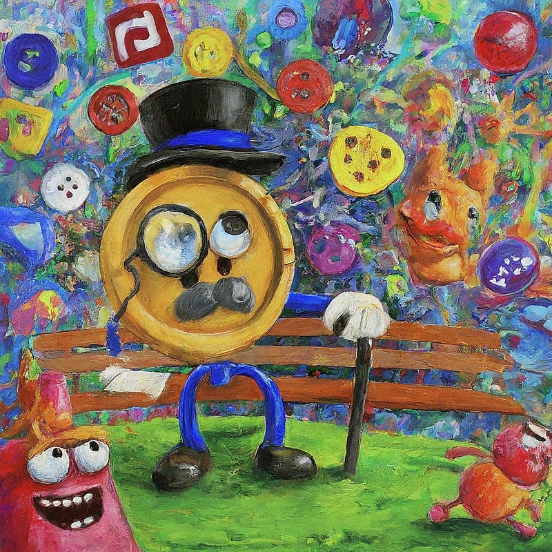
As time passed, Buttony found itself in less prominent positions within the application. No longer featured on the homepage, it became a secondary option tucked away in a corner. Still, Buttony had its fans; whenever someone clicked it, Buttony felt a fleeting sense of youth.
Understanding its role in the grand scheme of things, Buttony accepted that it had served its purpose well. It had endured multiple redesigns, numerous bug fixes, and even the notorious compatibility issues. Yet, it recognized the necessity for the new generation of buttons to take center stage.
Conclusion: Buttony's Legacy – A Tale of Transformation
Buttony’s journey serves as a poignant reminder of technology's ever-evolving nature. Each component has a narrative, reflecting its rise and eventual transition. From Buttony’s bright beginnings to its graceful decline, there are invaluable lessons in adaptability, resilience, and the importance of knowing when to step aside.
So, the next time you click a button, spare a thought for Buttony and the adventures it experienced. Behind every click lies a world of design, code, and a sprinkle of digital enchantment!
Chapter 6: A Day in the Life of Buttony
In this video, we explore the whimsical life of Buttony as it navigates the web world.
Chapter 7: Solving Buttony’s Challenges
Join us for a comprehensive playthrough addressing all of Buttony’s challenges in the digital realm.